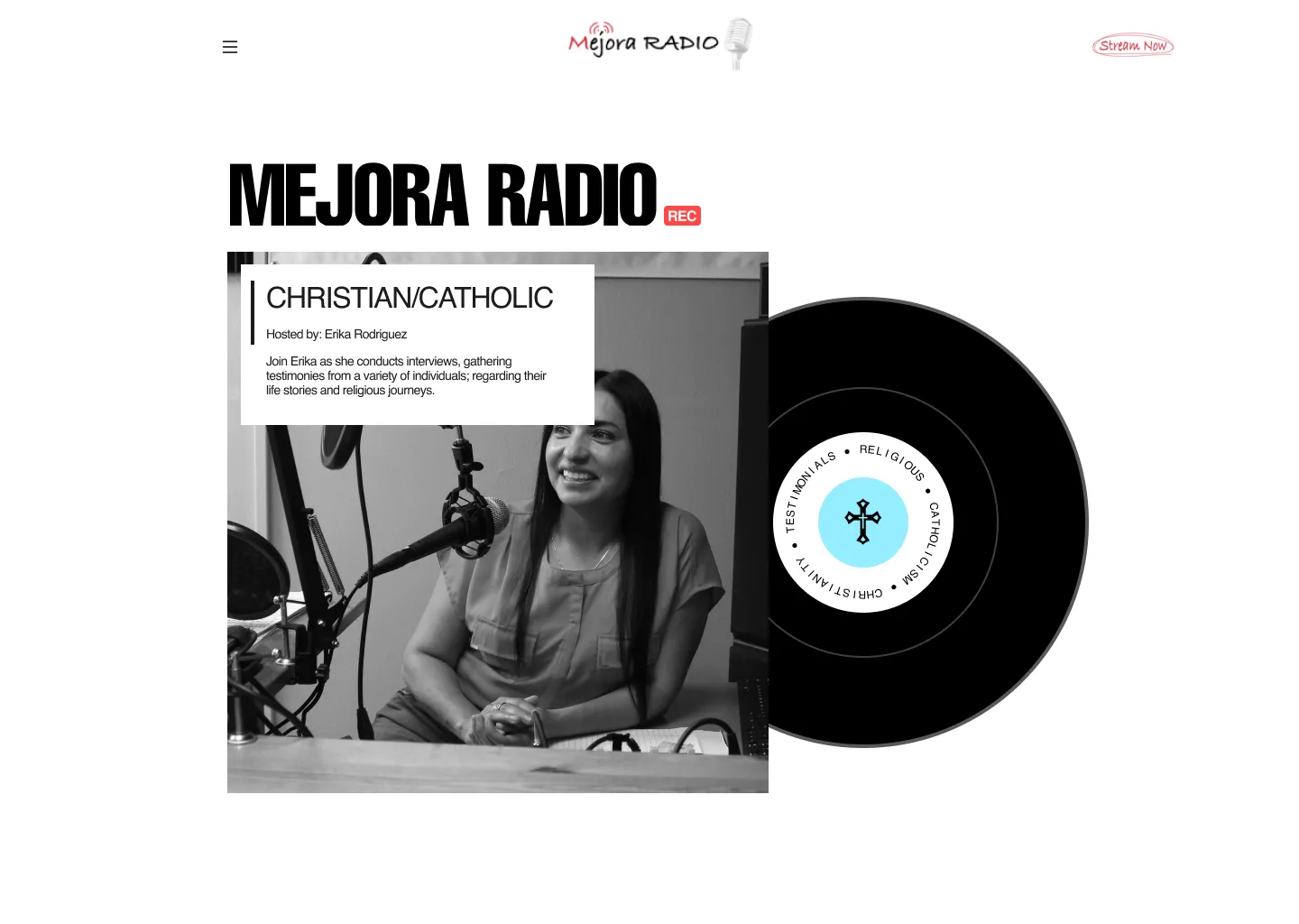
Mejora Radio
Context / Brief
The key focus of this project was to successfully bring the radio station online and make it accessible to listeners around the globe. Erika, who has been involved in the radio industry for over a decade, has a wealth of experience in managing and operating radio stations.

Art Direction
Erika went with a clean and simple design for ease of use. Red was chosen as the primary color because it’s the most intense colour that can attract attention and invoke strong emotions such as passion, and love these are the exact emotions we would like to invoke on users of the site, as many religious folk have a deep love and passion for their religion.

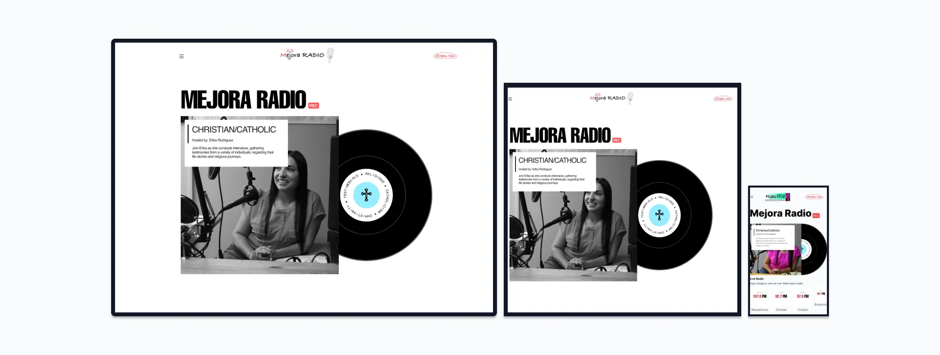
Responsive
Each page has been redesigned for better mobile and tablet compatibility.